Skip to main content
Design Seeds
Posts
Latest Posts
Succulent Hues
Color Spring
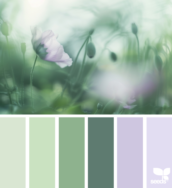
Color Field
Color Wander
Violet Frosted
Color Dabble
Spring Tones
Flora Brights
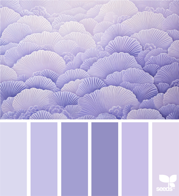
Amethyst Hues
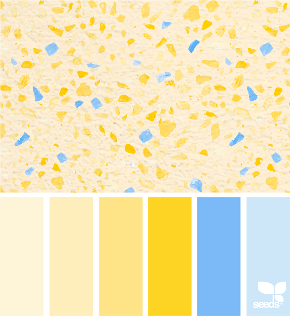
Terrazzo Tones
Color Flora
Fresh Tones
Flora Tones
Ruffle Tones
Color Calm
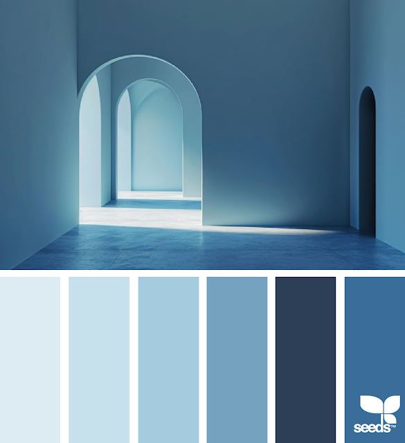
Heavenly Hues
Color Flora
Fresh Hues
Older Posts
search by color
_
“All the flowers of all the tomorrows are in the seeds of today.”